


Table of Contents
What Famous Car Logos Have Controversial Histories?
As a company, you want your logo to reflect the basic principles of your organization, but you don’t want to be the laughingstock of the modern world. A logo can help identify your target market, convey goals and aspirations, and even give customers a feeling of solidarity, safety, and security. Here are some of the most iconic logos and what they represent.
Alfa Romeo Logo - “Cross and Snake”

Alfa Romeo Logo
The Alfa Romeo logo features a complicated set of distinct designs on each half of a circle. The left side of the logo depicts a red cross on white background. The symbol pays homage to the city flag of Milan, Italy, where the company was located and has been established since 1910.
The right side of the logo features a green snake with a crown eating a man. This snake also symbolizes Milan when the powerful Visconti family ruled during the middle ages. As a general rule, they were paranoid despots who collected enormous taxes on the populace and killed countless civilians for the slightest complaint. The ruling family adopted the crest of a Viper (snake) swallowing a child or an Ottoman Turk (historians are divided on this subject) and placed it as a symbol on every public building to remind everyone who was in charge.
Over the years, the logo has had minor design refreshes and background color changes, but the two primary symbols have remained.
Mercedes Benz - “Three Point Star”

Mercedes Benz
Mercedes symbol has its roots in a postcard. When Gottlieb Daimler sent a postcard to his two sons, Paul and Adolf, in 1872, he marked the location of his home with the three-point symbol.
Years later (1909), when the two boys needed a better symbol to represent Daimler-Motor Gesellschaft, they looked to the three-point drawing their late father had sent them.
The Mercedes Benz logo represents Mercedes's determination to be the universal dominant force in land, sea, and air transportation. It would not be long before a fascist regime would almost make that ambition a reality. During WWII, Mercedes Benz built engines for the Nazis for both planes and land trucks. Their plants often used forced labor from concentration camps or prisoners of war. By 1944, the company had stopped car production and was dedicated to supporting the war effort. Years after the war, Mercedes Benz made reparations. While this period of history is a dark stain for everyone, the three-point symbol continues to be a part of the Mercedes global brand.
Audi - “Four Circles”

Audi
While Audi’s four connected circles might remind you of the Olympics, it represents the union of four German car companies, all based in Saxony, Audi, DKW, Horch, and Wanderer, in 1932. The new company was named the Auto Union and, following World War II, would have to relocate to West Germany due to the impending advance of the Soviet forces. Auto Union struggled, being taken over by Mercedes Benz in 1958 and then by Volkswagen in 1964. As the premium brand for VW, the name was eventually consolidated in 1985 to “Audi” since they were the only surviving member of the original four companies.
Chevrolet - “Bowtie”
Chevrolet
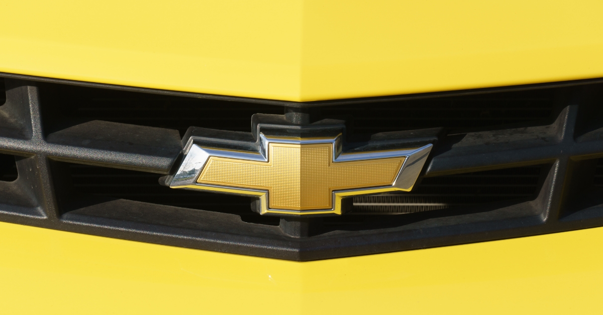
The Chevy “bowtie” emblem came to be in 1913, but there are several theories about how it was developed. One idea is that the co-founder of the company, William Durant, was mesmerized by the pattern he spied on the wallpaper of a Paris hotel. He tore off a piece, brought it home, and instructed his designers to use it for inspiration.
A second theory was promoted by Durant’s daughter in her memoirs, in which she claims that her father loved to doodle designs while sitting at the family’s kitchen table. Apparently, one night he scribbled out the design in between courses.
Another idea was floated by Durant’s widow, who claimed that the inspiration for the logo came from Coalettes, a fuel product promoted by the Southern Compressed Coal Company in a Nov. 12, 1911 edition of the Atlanta Constitution. The coal company’s logo is very similar to the slanted bowtie form of what would become Chevy’s logo. (And the date of the ad is only a little over a week after the incorporation of Chevrolet as a car company). There is no word as to whether Durant paid any fee for using the logo.
A fourth theory claims that the logo represents the Swiss flag with a white cross on a red background. (Louis Chevrolet was born in Switzerland). The story indicates that Chevrolet and Durant worked to modify the “cross” by squishing it down and slanting the sides to produce the desired effect.
Since 1913, the “bowtie” has undergone several modifications, until 2004, when the company began using the Gold Bowtie that has become the iconic design we know today.
Bentley - “Wings”

Bentley
Bentley is a British automaker with a rich tradition of making luxury automobiles. Though it has been a part of the VW premium group Audi since 1922, the company was its separate entity for many years. The emblem features the letter “B” attached to the wings. The B stands for Walter Owen Bentley, who founded the company. The wings pay tribute to the company's original name, Bentley Aero, which manufactured rotary engines for airplanes during World War One.
Toyota - “Name”

Toyota
An excellent way for a company to help its customers to remember the logo is to incorporate the name in some fashion. While most companies like Nissan or Aston Martin overlay the name on top of a logo, one Japanese car maker did something clever. It hid the name inside the overlapping ovals of its car brand logo.
Most people recognize the “T” in the dual ovals that make up the logo (a flat horizontal circle laying over an elongated vertical one). But, if you look more closely, you can see the “O,” then the “Y,” again with the “O,” followed by a small case “t,” and ending with an “A”. T-O-Y-O-T-A.
Another explanation of the logo concerns the conjoined perpendicular ovals representing the relationship between the company and the customer. (The horizontal oval represents the customer, and the vertical oval is the company. The large outer oval represents the world). If you look closely, you can see the company’s commitment to supporting its customers throughout the globe.
Toyota started using its current logo in 1989 and has remained the same since then. Considering that in the United States alone, this car company sells over 2 million units yearly, many “T” shaped ovals roll down American highways.
Plymouth “Mayflower”

Plymouth
When Plymouth wanted to design a brand to help customers remember who they were, they turned to a ship, not a car. In one of the most confusing, complicated, and misguided logos of all time, Plymouth “Mayflower” sailing ship must be one of the worst-designed logos ever. The ship was supposed to remind folks of “Plymouth Rock” where the first settlers landed, starved but survived to begin our nation.
Plymouth kept the original “Mayflower” logo until 1961, and then for the next forty years, played with various designs, from incorporating the Chrysler Dodge star to just writing their name across the screen in simple, straightforward lettering. Eventually, Plymouth would turn to a sailboat, this time as their logo (1996), for the final five years it was in business.
No amount of logo magic could keep Plymouth alive, and now, over twenty years later, no one remembers the logo.


