5. BMW Z8

Okay, the Z8 is probably one of the most drop-dead gorgeous cars made since the turn of the millennium, and the gauge cluster is no exception. The vehicle is a retro-futuristic masterpiece, and the gauge cluster is no exception. The gauges are clear and precise looking—molded into the dashboard like something out of a custom 1930s race car. BMWs have had the trademark orange backlighting for years, and the Z8 probably had the best use of this backlighting. The effect so perfectly fits the car; it’s a textbook example of how good design can enhance the driving experience.
4. Porsche Cayenne

Source: Porsche
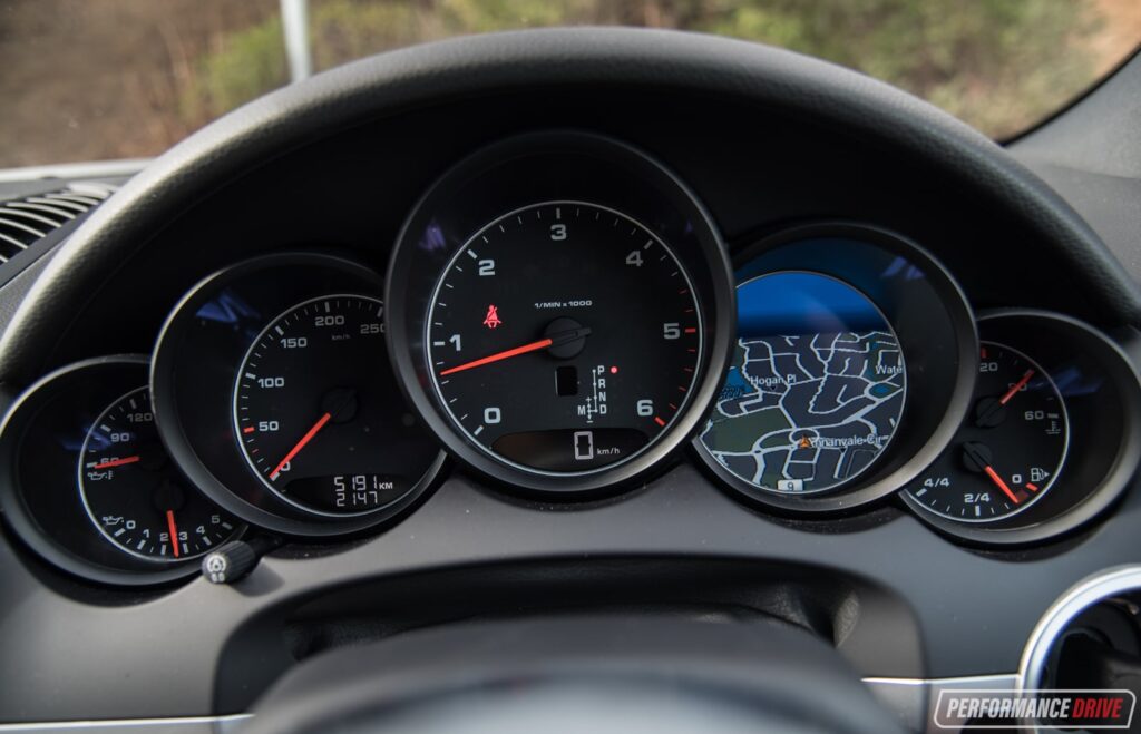
Porsche is right up there with BMW in the iconic gauge cluster arena, and translating that design to their first SUV (the Cayenne) could have either gone really well or quite poorly. Whelp Porsche fucking nailed it, and gave us a perfect blend of sporty, functional, and elegant—and had possibly my favorite example of integrating a navigation screen into the instrument panel. Very cool Porsche, very cool. This is an example of what I expect from German engineering, and it didn’t disappoint like the Mercedes monoblade.
3. Toyota Prius (Second Gen)

Don’t you dare fucking laugh. The Prius may be a slow, egg-shaped, sanctimonious virtue signal on wheels—but it was truly a tech innovator when it came to the interior user interface.
The whole idea of electric cars having futuristic, computerized user interface goes straight back to the Prius—Tesla and all the rest owe this powerful design influence almost entirely to the omnipresent plug-in keigel on wheels. It’s simple, engaging, and futuristic—and completely on-brand for the car. A textbook execution on Toyota’s part, and (in my view) a future classic for that reason.
2. Tesla Model 3

Source: Tesla
Okay, there’s a reason there aren’t any other American cars on this list—we’re complete shit in the area of making gauges. We can make them tacky, goofy, or bargain-basement cheap—but for some reason, we can’t dial it in as well as our competition… until the Model 3. The gauges on the Model 3 perfectly reflects the changing nature of how we interact with our cars: we have a need for speed, and only speed, in our instrument clusters in electric vehicles. The Model 3 doesn’t do everything right—but it can be credited as the first car to make the leap to one big ass screen. And it’s MURICAN’ BABY, YEEHAW!
1. Honda Accord and CRV

Honda is probably one of my overall favorite manufacturers when it comes to good, thoughtful, common sense design…that also doesn’t look cheap or like complete shit. From the 70s through the early 2000s Honda had the best gauges of any non-German car pretty much bar none—because they straight up just copied BMW. It’s one thing for an expensive car to have an expensive looking gauge cluster—its a much bigger accomplishment for a reasonably priced car to have any piece of design that feels genuinely premium.
Honda accomplished this with their amazing floating needle speedometer design: a design that not only improved on the Mercedes original but still looks perfectly modern today. Honda has had a wonderful tradition of showing us that good design doesn’t need to be expensive, and god bless them for it.


